Quake Talk: San Jose Earthquakes unveil new logo and jerseys

February 1, 2014
Holding banners, throwing scarves, and yelling their hearts away, the 1906 Ultras walked toward San Jose’s San Pedro Square Thursday, cheering on their team, the San Jose Earthquakes.
Chanting “We are Ultras” and “Earth…Quakes”, the Quakes’s largest supporter group walked toward West Saint John Street.
Forty years of Earthquakes history had passed, and it was time for something new: a new logo on a black, blue, and white shield.
Johnny Moore, a retired player from the Quakes’s first season, pumped up the crowd for the logo’s unveiling, pausing to stop the tears.
“When you come to San Jose, you come here to fight,” Moore said.
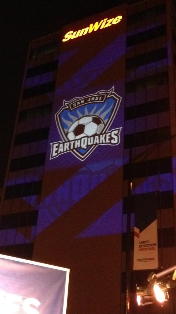
Quakes president, Dave Kaval, played a video on the SunWize Company building that explained each component of the new logo.
The shield honors soccer tradition; the three sides represent San Jose, Oakland, and San Francisco.
The soccer ball symbolizes the devotion to the game.
The shortened name of Quakes embodies the unity of the team and fans.
The blue and black impact pattern represents the shifting of the tectonic plates.
The axis that holds the ball represents a globe and connects to the original logo from 1974, when the Quakes became the first professional franchise of San Jose.
After the unveiling, SCHS freshman Noah Manacmul said, “They have surprised me. I am especially happy that they were able to use key components from the past logos.”
Manacmul and many other Earthquakes fans shoved their way to the merchandise shop to buy jerseys with the new logos.
The primary jersey is blue with a faint impact pattern just like the logo, while the secondary jersey is red with the hashtag #NeverSayDie on the back.
“This organization is about ‘never say die.’” San Jose Earthquakes Hall of Famer Troy Dayak said.
This new logo and jersey represent a new era of Earthquakes soccer with a new stadium coming for 2015 and more years of passion for the soccer club of the Bay Area: the San Jose Quakes.


