

OPINION: Modern Novel Cover designs are lazy, uniform, and lack artistic originality
Never judge a book by its cover. Despite this common phrase, the simple aesthetic, title font, and cover art can be key factors in a reader’s decision whether or not to pick up a book. It is apparent that the covers of novels have changed over time, often for the worse.
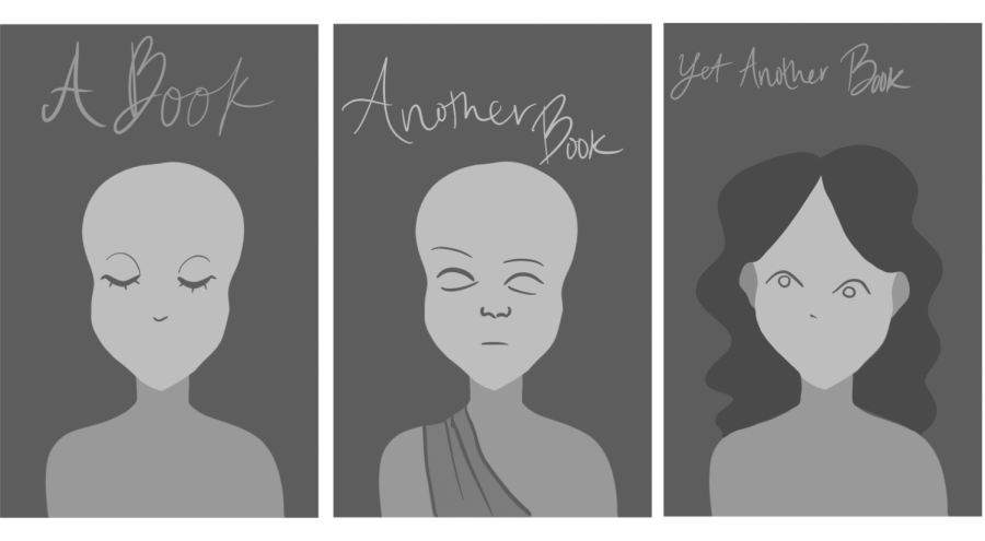
Many novel covers nowadays bear a distinct similarity among genres and design trends. Countless are either edited photographs, cartoonish images or bold lettering, among other styles. While some designs can be attractive to the reader, when most novel covers have very similar designs, nothing stands out. When a reader is standing in a bookstore or browsing online, a sea of interchangeable covers makes it difficult to distinguish between any given selection.
The current trend of covers – such as how most contemporary romances have covers with digital art and the same interchangeable characters – makes the books look cheap and the publishers lazy. In the past, many covers were drawn and not just photos, which took time and effort. For example, J.R.R. Tolkien’s “The Lord of the Rings” and J.K. Rowling’s Harry Potter series have illustrated covers on them that represent the characters and worlds in which the stories take place. Nowadays, covers such as the original cover of Brandon Sanderson’s “Steelheart” appear as if there was little effort put into them, with merely a few inputs in Photoshop that do not do a good job at representing the story or setting of the novel.
Additionally, these seemingly lower-effort covers do not elicit the same emotion that older novel covers may have. Take horror novels for example. Older novel covers, such as the original cover for Steven King’s “It” or Ruby Jean Jensen’s “Home Sweet Home,” are designed to be terrifying and attract fans of the horror genre. Horror novel covers from today, such as Katie Alender’s “The Companion” or Joe Hill’s “Heart-Shaped Box,” simply cannot compete with the fear sparked by older covers.
Some may argue that modern covers have more mature and elegant designs than older ones, appealing to their target audiences. While some may seem to be “mature” without the potentially cartoonish features of an illustration, they are lacking the features that make them memorable or interesting. Considering that most modern covers follow the same trends with their design, they end up looking very similar. The original covers for Margaret Atwood’s “Stone Mattress” and Marlon James’s “A Brief History of Seven Killings,” both feature images of blackbirds in front of yellow backgrounds, that some could easily mistake for one another.
While the covers themselves usually convey nothing of the novel’s overall quality, they play a key factor in the reader’s ultimate decision. The design of a novel cover is important so that the reader can discover a book that could be the next modern masterpiece, or at least one that many others could enjoy.